Pantone’s 8 Color Trend Predictions For Next Season
Top row: Verdure, Playful, Discretion, TECH-nique. Bottom row: Far-Fetched, Resourceful, Intricacy, Intensity.
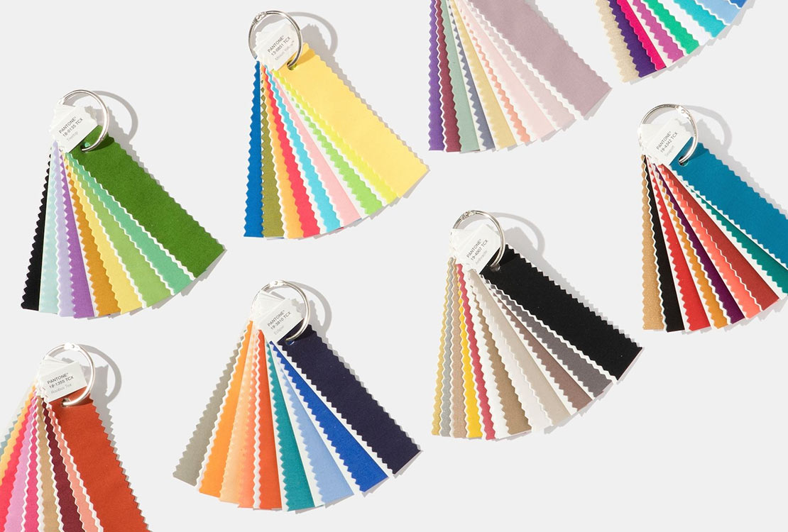
Pantone is highly renowned as the global authority on color. As such, it has also become a powerhouse trend forecaster. It has a spotless track record of predicting the it-color of each year, like the infamous color duo of 2016, Rose Quartz and Serenity. Color predictions are the foundation on which home décor trends are based. And in 2018, there are a lot of colors being introduced. In fact, there are 8 color predictions that are grouped based on the concepts they signify. Pantone Executive Director Leatrice Eiseman shares her wisdom on each one:
1|Verdure: Pantone’s color of the year for 2017 paved the way for this nature inspired palette. Like Greenery, it focuses on health and nature, but has homed in on vegetal colors for 2018’s palette. Colors like Celery are paired with berry, colorful purples and eggshell blue to convey well-being.
2|Playful: The brightest and most fun color group of next season’s bunch. With whimsical names like Minion Yellow and Lime Popsicle, it’s easy to see what mood Pantone was going for. The lighthearted colors of yellows, greens, blues, red, and pink will be a delight to design with.
3|Discretion: This palette is already known for being the opposite of Playful. It is a subtle palette that is made up of vintage colors like Elderberry and Hawthorne Rose that invoke a new sense of strength. “Pink has developed more power than ever before,” said Eiseman.
4|TECH-nique: In line with our never-ending fascination with technology, this group is dedicated to technology itself with Frosted Almond as a clear indicator. Bright colors like pink, turquoise, and purple make up this group and are balanced with Brilliant White.
5|Far-fetched: Down to Earth colors like Cornsilk Yellow and Rooibos Tea are reminiscent of culture styles from around the world. This warm and rosy toned color group “reaches out and embraces many different cultures,” said Eiseman.
6|Resourceful: In color science, blue and orange complement each other with balance. Warm and cool colors make up the palette with a clever blend of re-using what consumers may already own. Black anchors this palette down and ties it all together.
7|Intricacy: The new neutrals are a force to acknowledge and metallic colors are the new addition to the family. This group also references our growing tendency of wanting intricate details like wall paper patterns included in our home. Accent colors like Holly Berry Red and Sulfur Yellow balance out this otherwise neutral dominated palette.
8|Intensity: This powerful group combination echoes the intense times we’re going through now. They are an eclectic compilation of colors that were chosen with purpose. With shades like Emberglow, Molten Lava, and Bossa Nova, it is sure to inspire the boss in you.
It’s going to be a colorful 2018! We can be sure that these color predictions are going to inspire designers to find unique and creative ways to incorporate 2018’s colors.
For more ideas or questions, contact Lucy Parker (@lucyluvsdesign), Resident Designer at HomeDecorAZ.com
